
Days of Future Past: ‘62 Chevy Corvair Monza GT
This mid-engine, concept car foretold the styling of many GM sports cars. I finished this render in 2016, when I was still using a more painterly rendering style. The magenta background reflects in the hood/fender to add some interest to the silver body. More demo videos here.
‘26 San Marino Motor Classic
As always, I had a fantastic time exhibiting my work at this amazing classic car concours and fine art expo, which supports a number of worthy charities. I felt honored to have my Duesenberg artwork represent the show on the program cover, and other materials.
The artists’ reception was a great time, and I believe Saturday evening’s charity gala set record attendance (private tours of Jay Leno’s, and Aaron Weiss’ garages raised $25,000)! Sunday’s relatively cool weather brought out a large crowd — it was so busy that I barely had time to take any photos, browse the cars (or even eat)! But it was certainly worth it to socialize with enthusiastic attendees, talk about my artwork and hang out with old and new friends/colleagues. I’m already looking forward to next year’s event! More photos here.
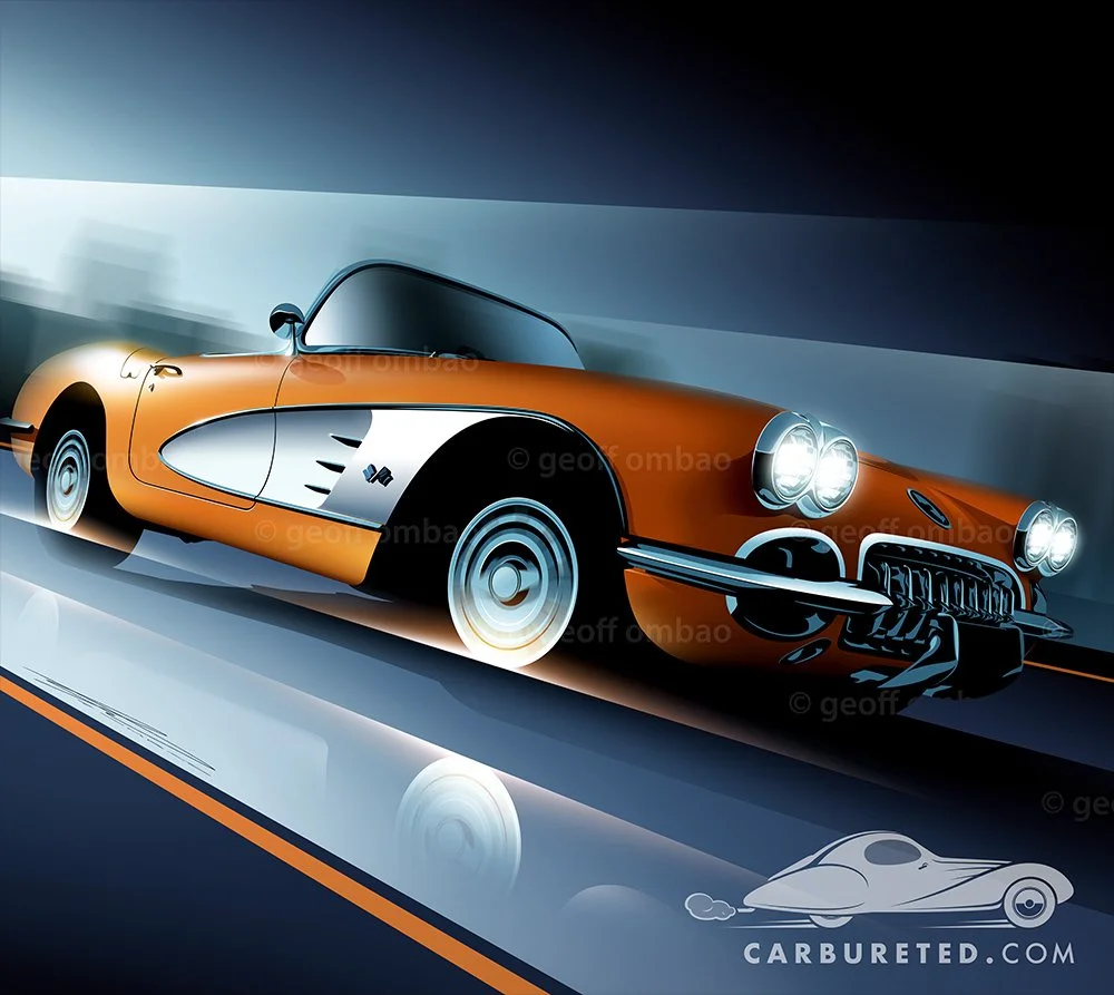
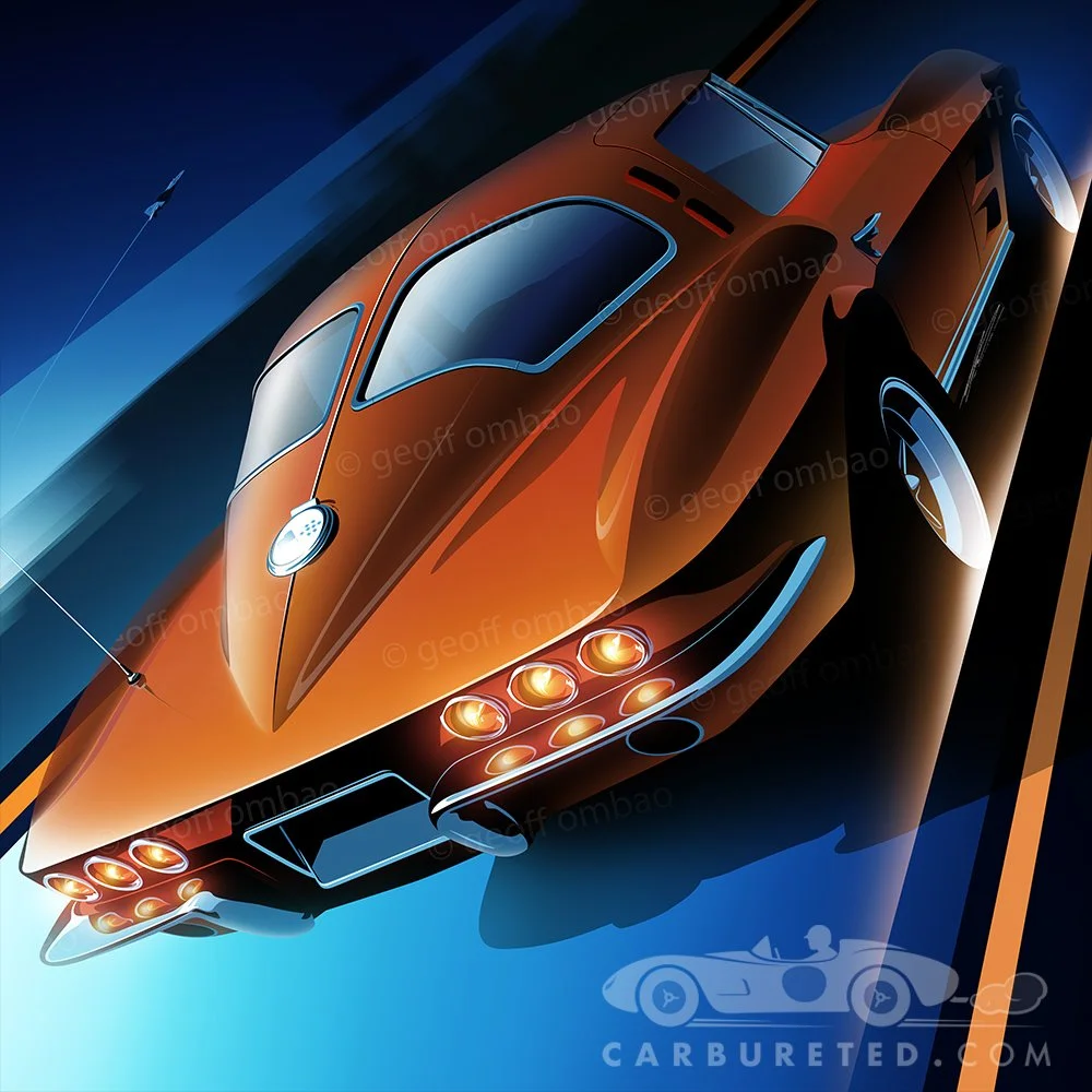
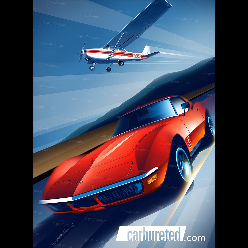
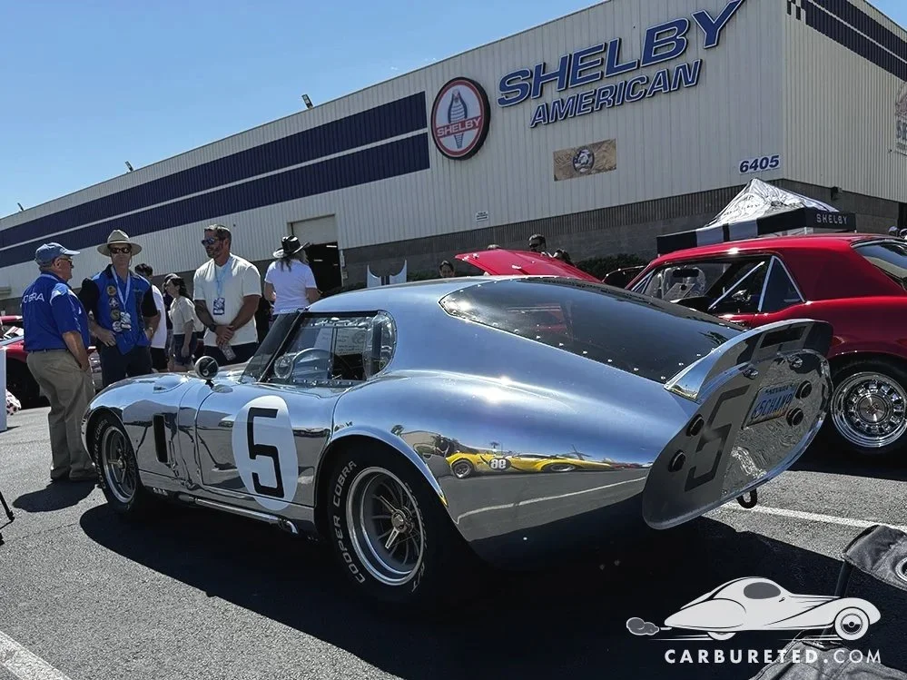
… Baby You’re Much Too Fast
Celebrating the first three generations of the American sports car icon.
Though my work tends to skew more heavily towards the European makes, I do love American cars, which were always in the family when I was growing up.
Digital paintings, Adobe Illustrator & Photoshop. No AI. More artwork featuring American classics can be seen here.
Adobe Illustrator/Photoshop. As always, no AI.
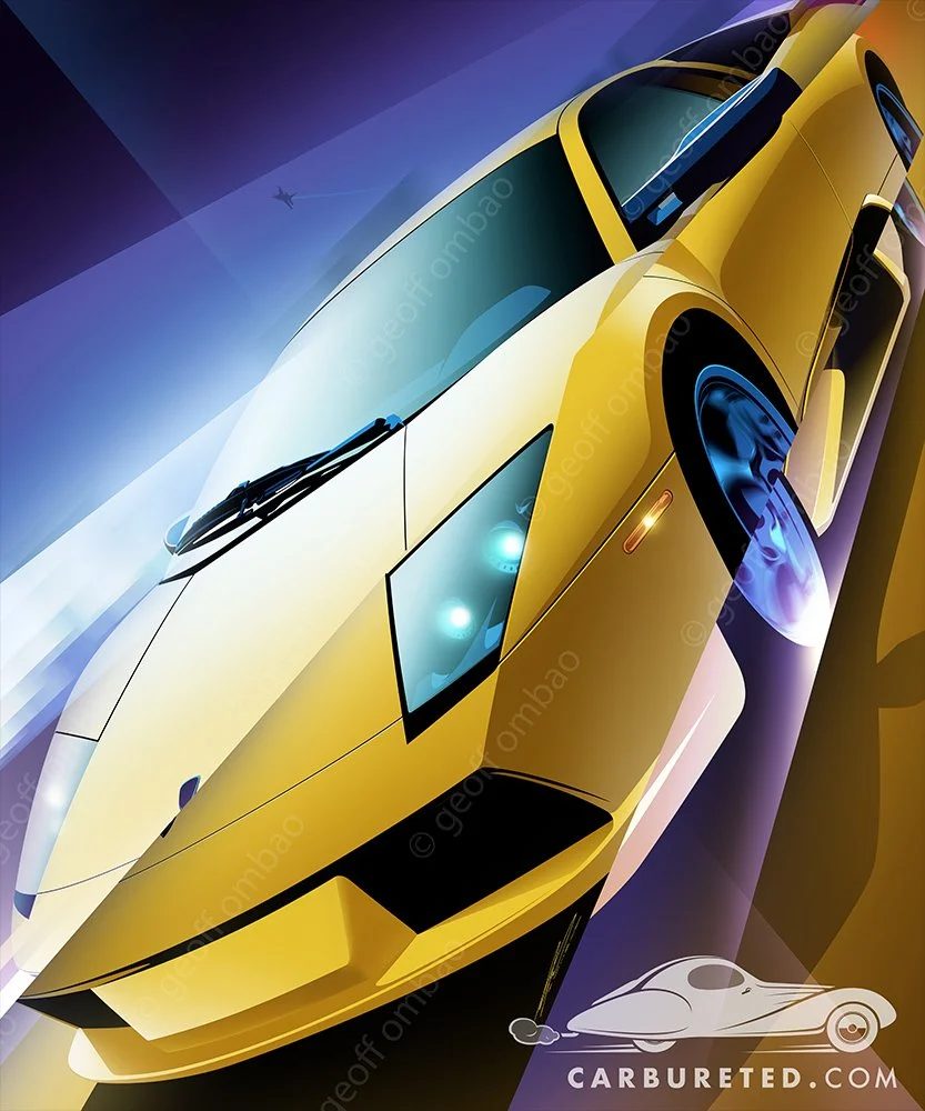
Murcielago
Lately, I’ve been abstracting my renders with a bit of fragmentation, which obscures the car (while remaining recognizable). This technique seems to work well with the angularity of this Lamborghini.
The primary fragmentations follow the right vanishing point to help emphasize perspective, and movement. (Of course, since I’ve shifted the pieces of the image forward/backward, perspective is no longer absolute.) A diagonal slash from the upper left to lower right draws the eye to the headlight, which is centered in the frame.
I chose a yellow and violet pallet because create vibrancy when juxtaposed. (They are opposite to each other on the color wheel.)
More renders/videos here.

More Content…
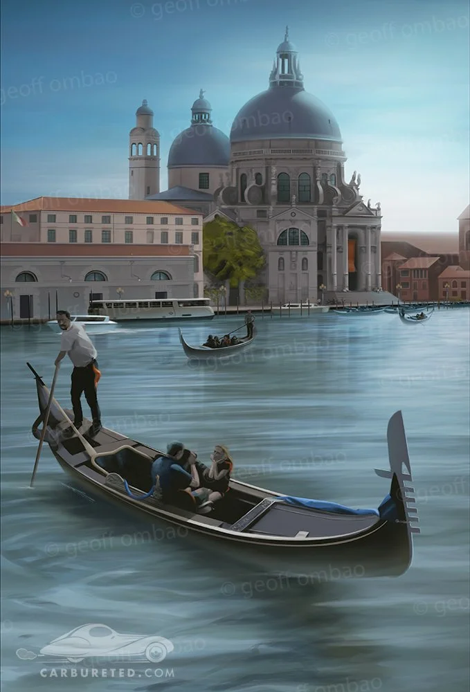
Wait… that’s not a car, is it?
Well, gondolas are vehicles, so I guess this isn’t completely off brand.
As much as I absolutely love creating automotive art, and have an on-going fascination with Art Deco, I think it’s important to explore lots of different… [More]
Seen in the Wild…
Movie tribute cars are so cool to see on the street. When I lived in LA, I’d see them often (Batmobile, BTTF time machines, etc.), but less so here in Nevada. Which makes sightings even more special. I saw this Jurassic Park Jeep at the local Panda Express. I’m not an expert, but it looked like a faithful homage to me!