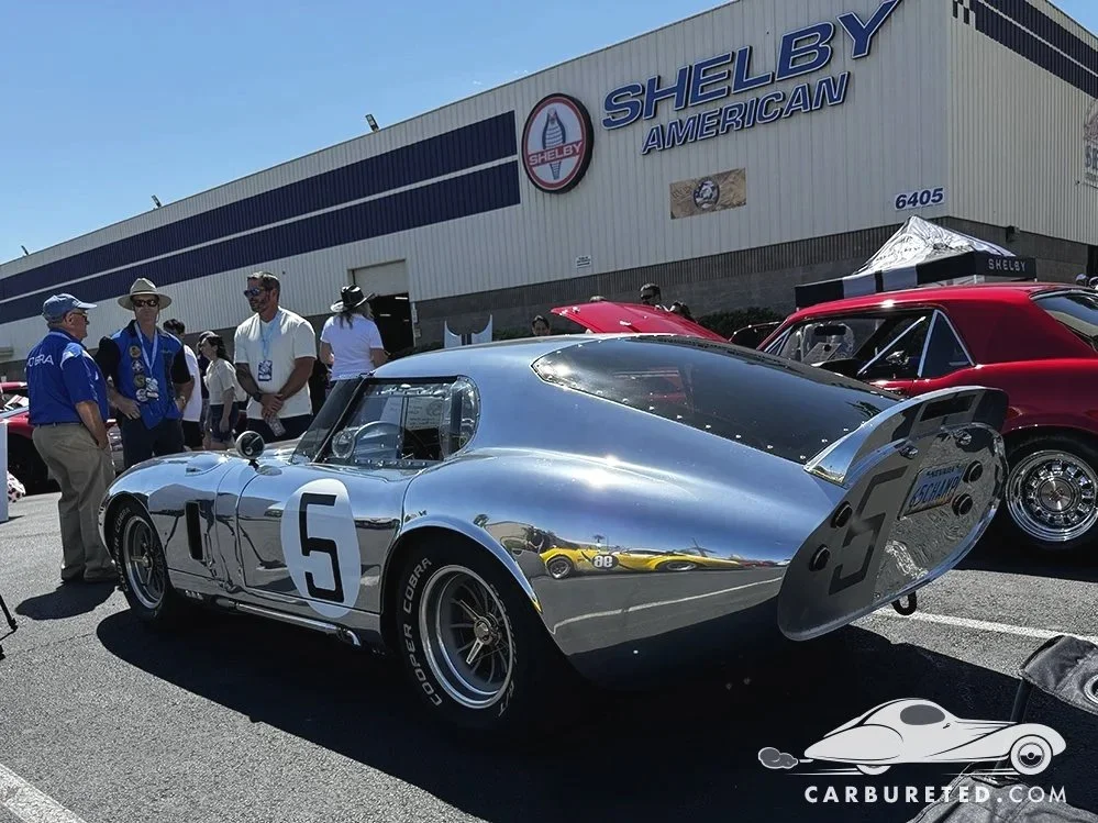
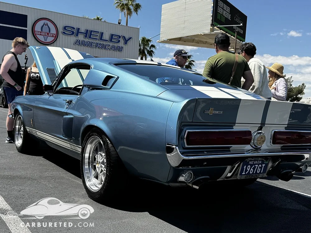
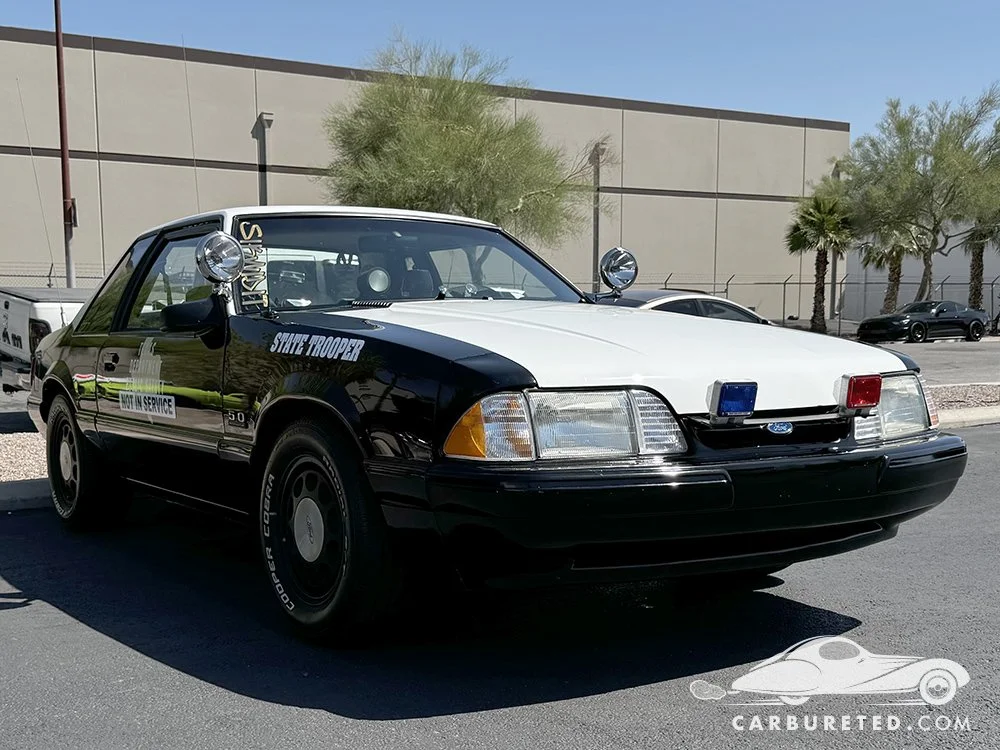
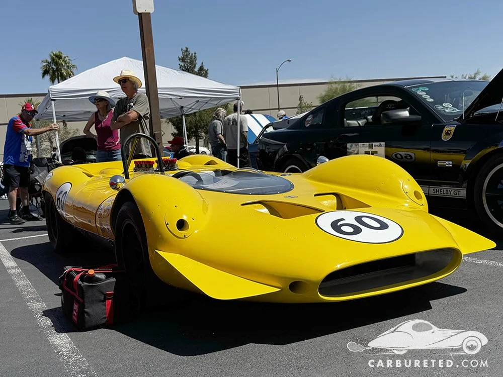
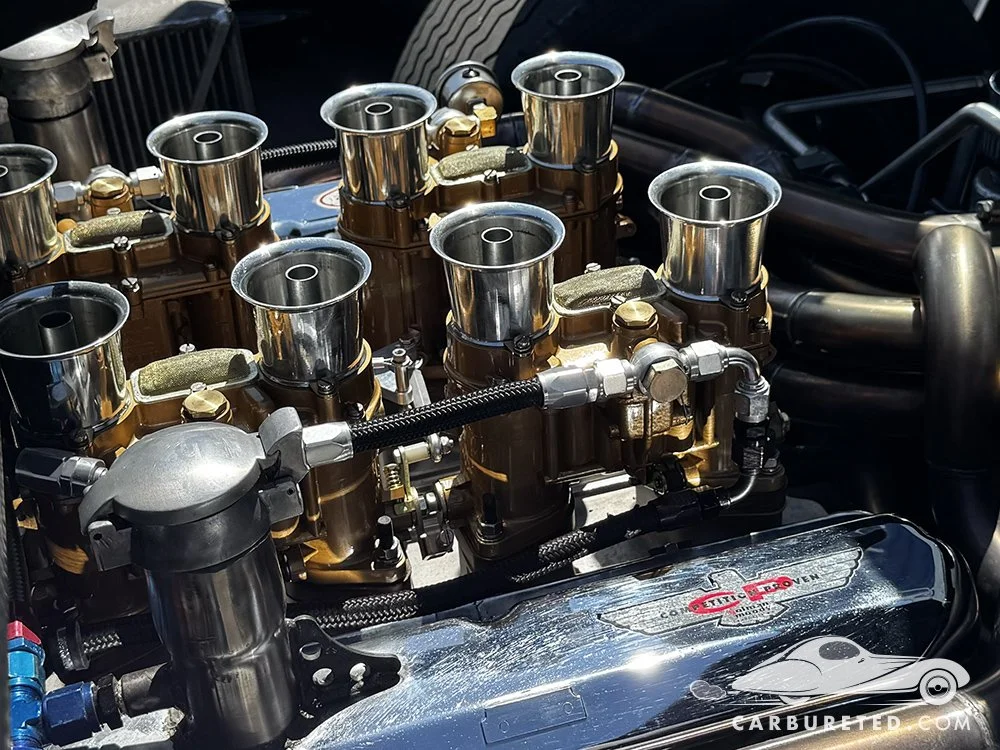
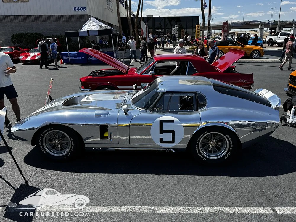
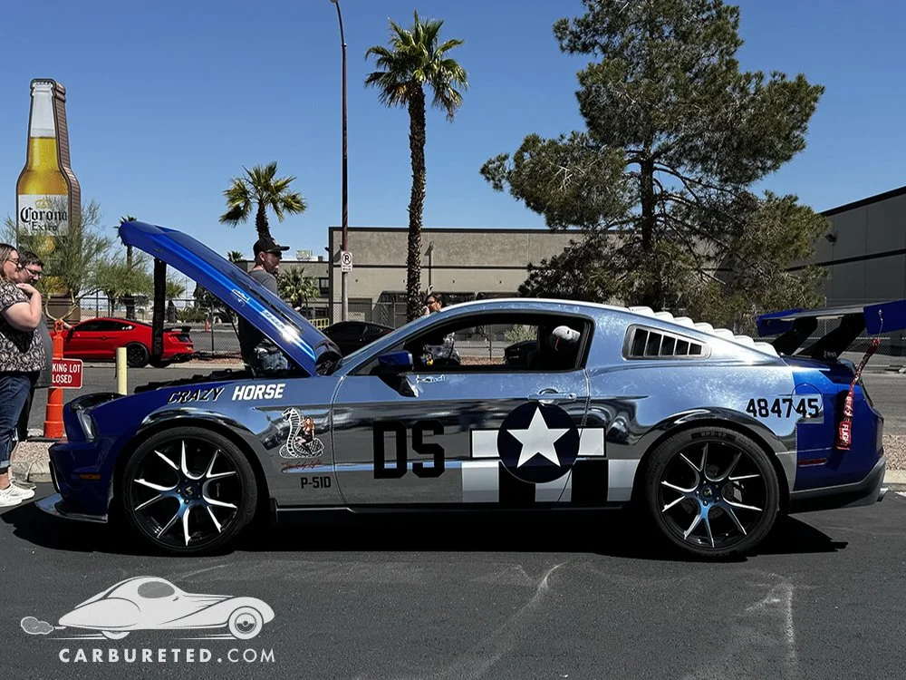
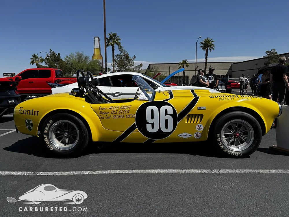
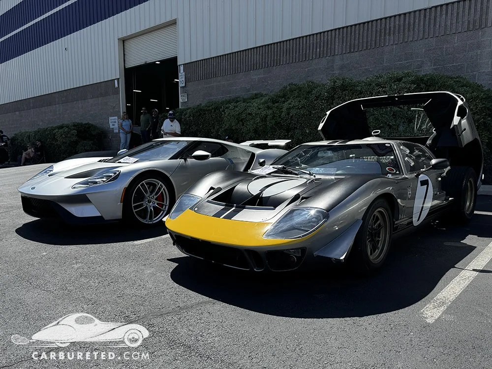
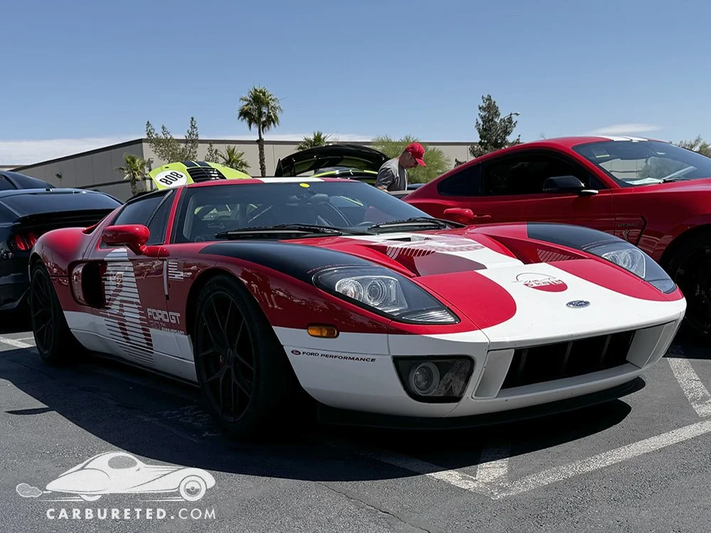
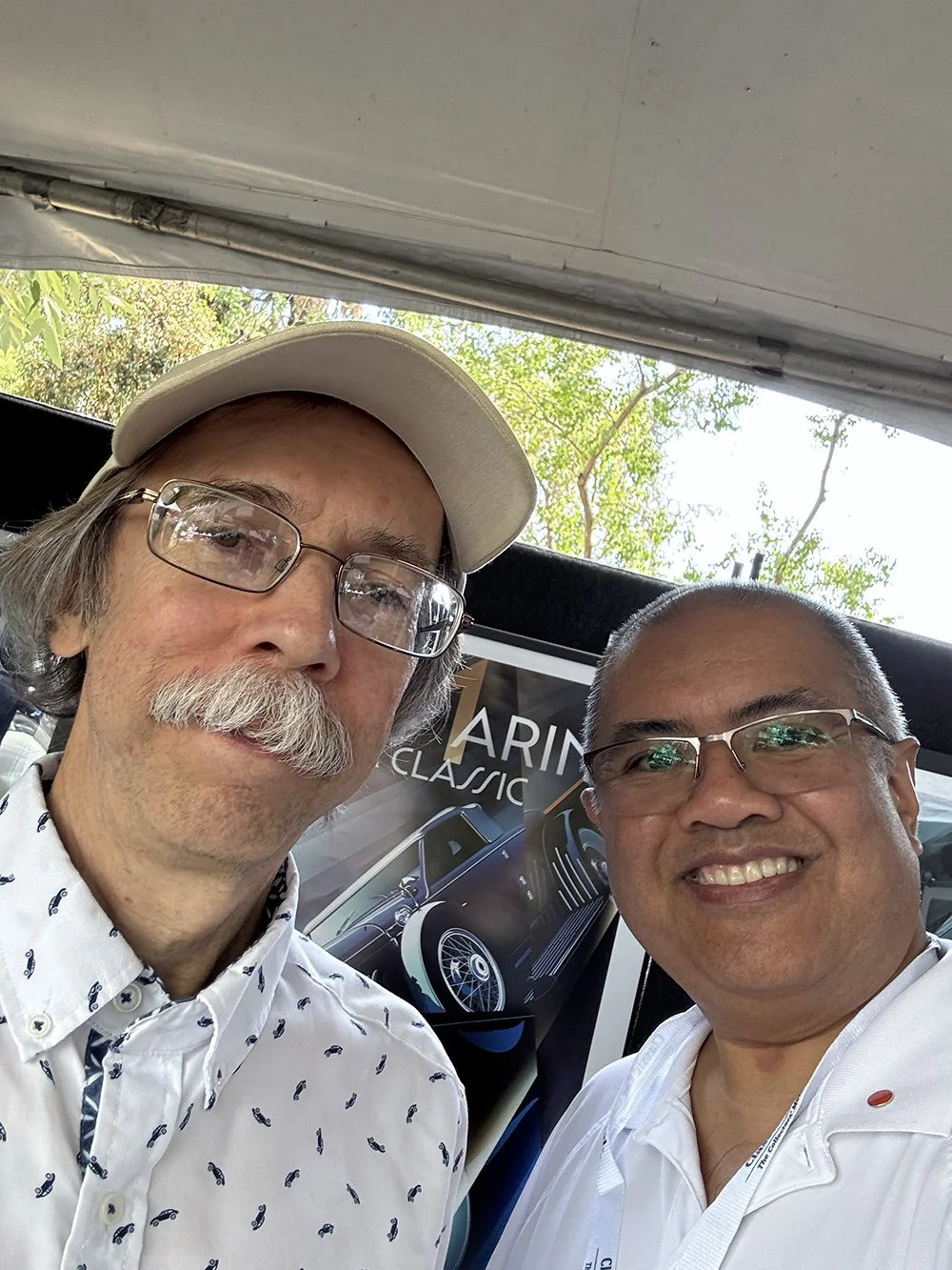
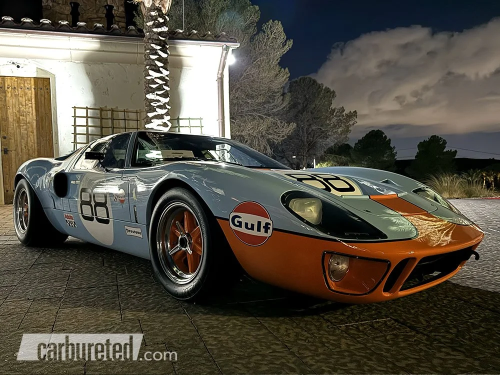
(May 8) Earlier this week, Las Vegas was treated to a car meet for Ford/Shelby aficionados at the Shelby America. An enthusiastic crowd browsed the myriad of Mustangs, cobras, Ford GT’s and GT40s that graced the lot. This museum is worth a look even when a car meet isn’t going on. Typically, rare/noteworthy cars are on display inside, and tours of their manufacturing facility are available. A retail space is well-stocked with merchandise for Ford/Shelby fans.
Unique Cars at the Lake
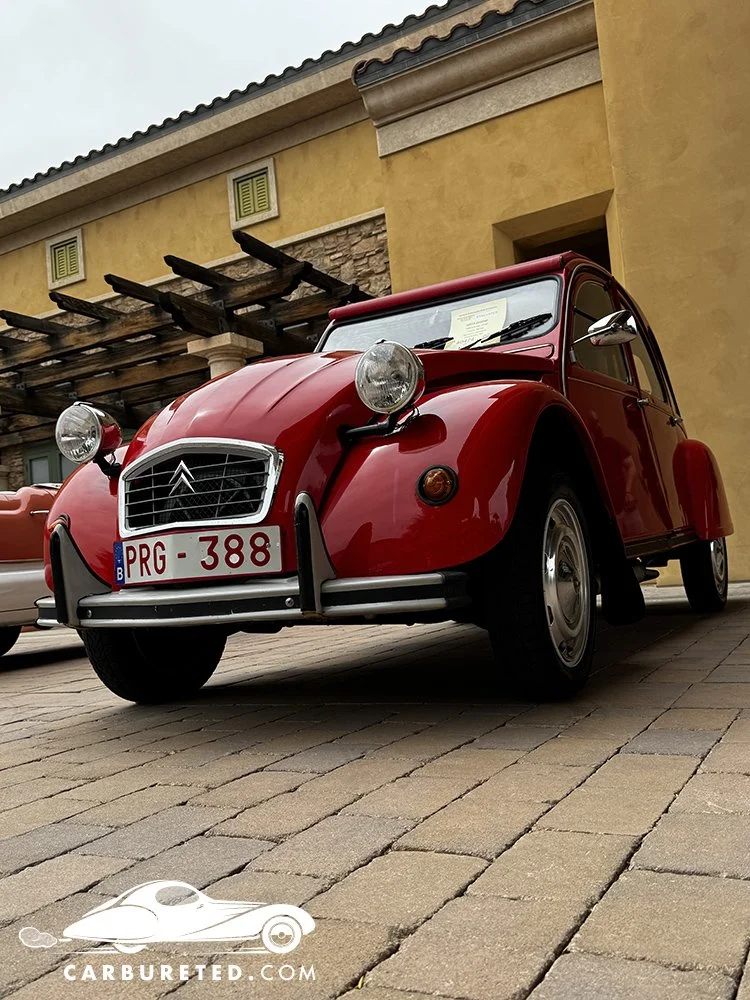
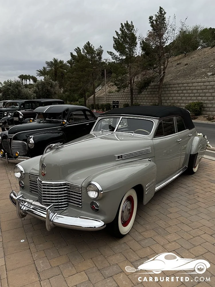
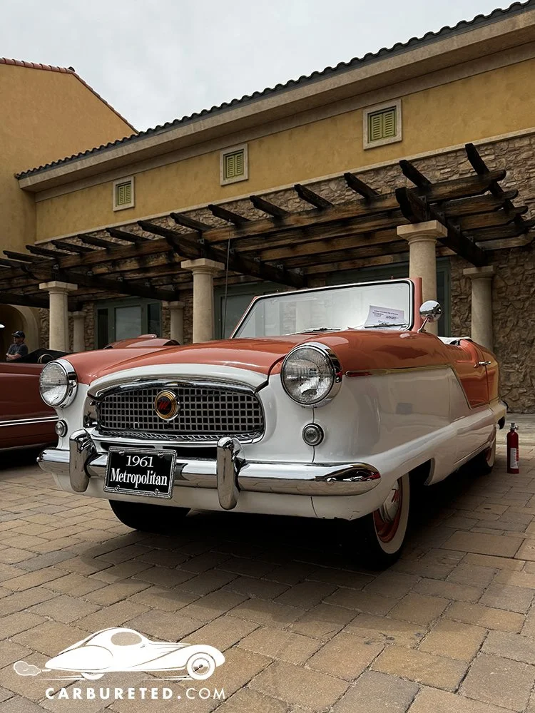
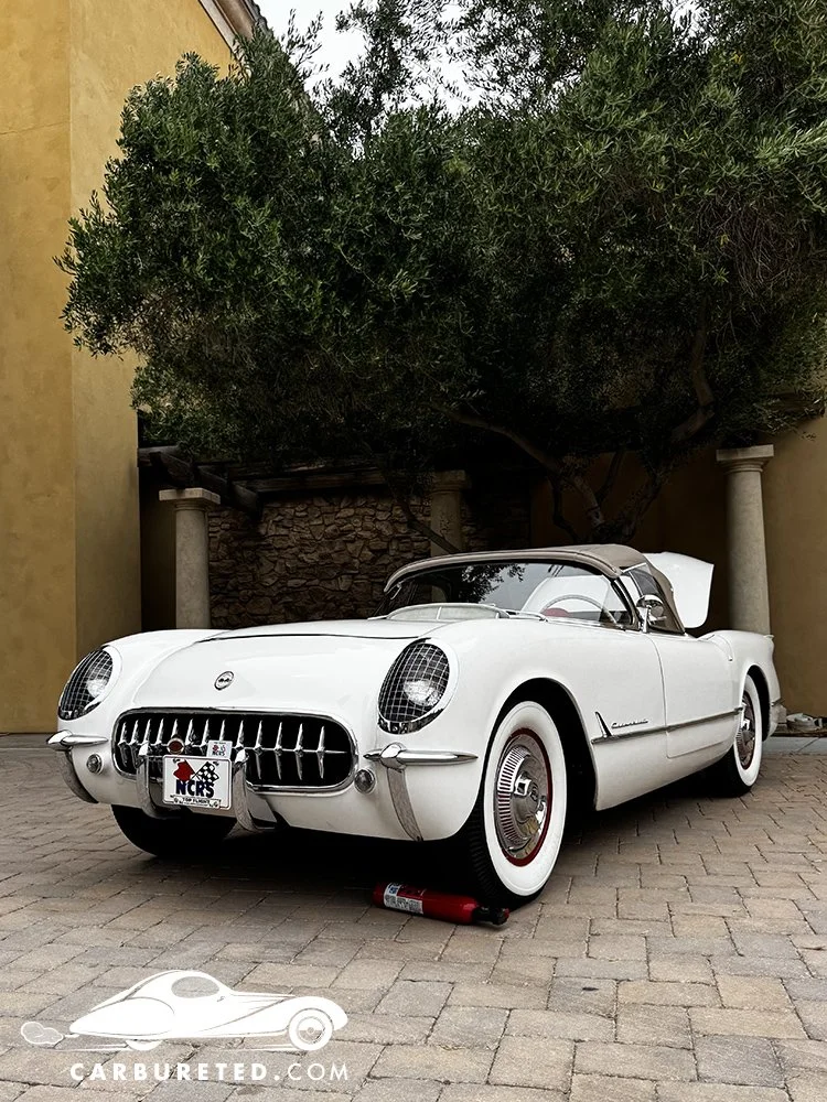
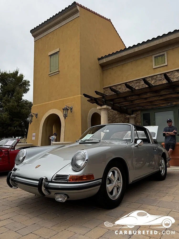
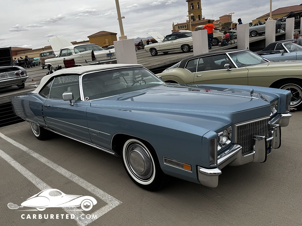
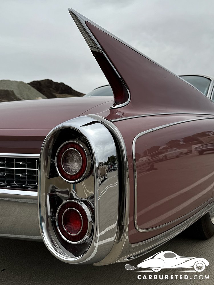
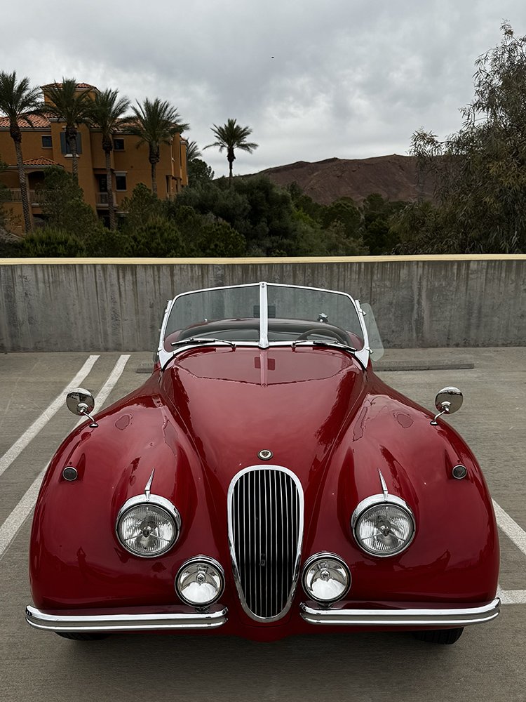
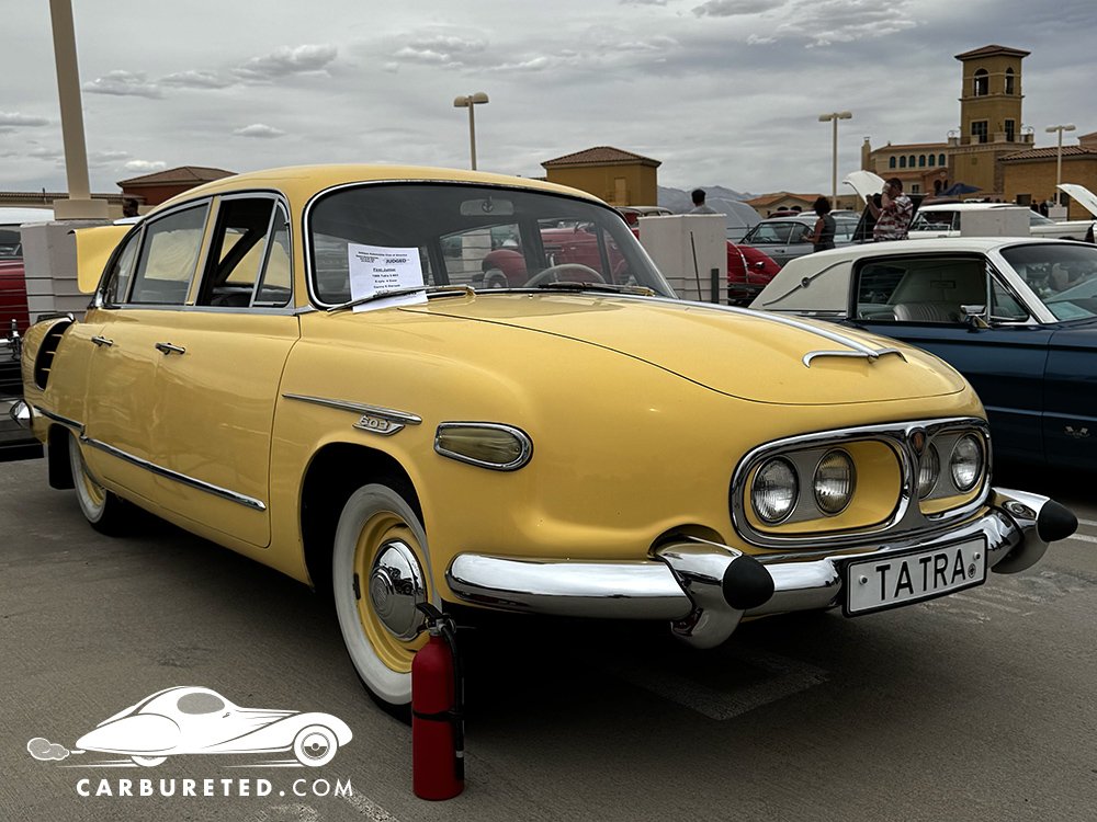
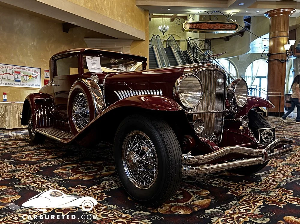
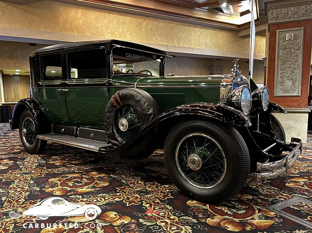
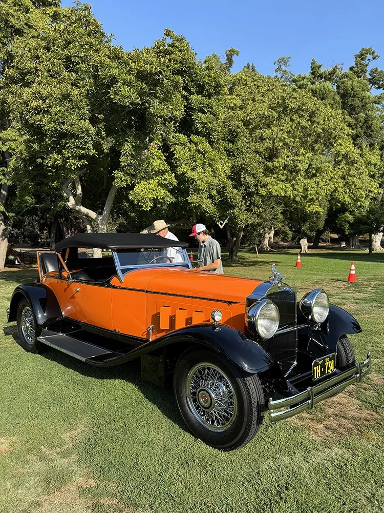
(April 25, 2026) Exhibitors from as far as Virginia (as well as locals) presented their classic cars at the Antique Automobile Club of America’s Western Regional Show at the old Casino Monte Lago (Lake Las Vegas). Though the assortment did seam to skew a bit more heavily towards American marquees, there were Porsches, Jaguars, and more to pique the interests of everyone. The amazing pre-war cars displayed inside the casino were of particular interest to me.
This was my first time in the casino, which closed more than a decade ago. Surprisingly, the space was well maintained, and inviting. I imagine that the adjoining Hilton Hotel uses it regularly for special events such as this. It made for an intimate, elegant setting for the cars stage within. A handful of well preserved/highly restored classics were featured at the casino’s porte cochere, while a wider array of cars were shown in the adjacent parking structure.
Generally, the cars here were in great condition… I didn’t stick around for the awards, but I’m sure the judges had a tough time deciding who would go home with the trophies!
Throwback Thursday
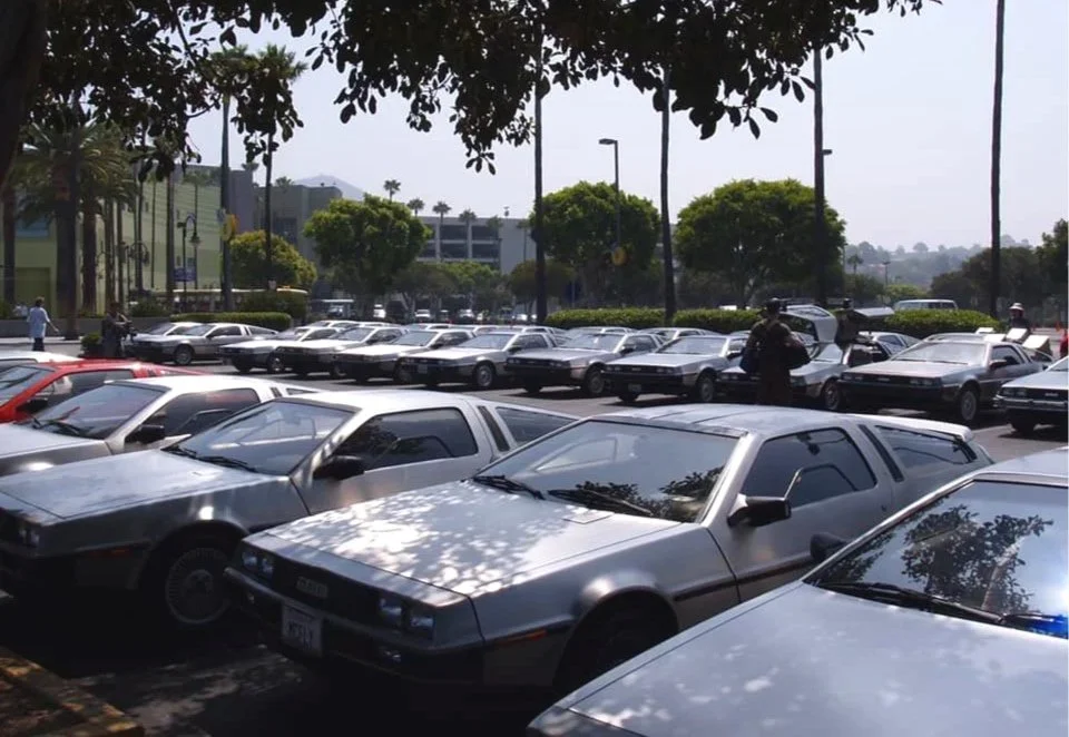
Circa 2007… Universal Studios Hollywood closed the Back to the Future Ride to make way for a Simpsons attraction. To mark the event, they filled their parking lot with Deloreans, and did a little show in the park. (I don’t know which one is mine.)
Throwback Thursday
My first classic car digital painting; a homework assignment for Visual Communication 5 at ArtCenter (circa 2015). Created entirely in Photoshop (no vector paths), the workflow is quite different than that of my current work. The result is a softer, more painterly look. (It should go without saying, but no AI.)
Wait… that’s not a car, is it?
Well, gondolas are vehicles, so I guess this isn’t completely off brand.
As much as I absolutely love creating automotive art, and have an on-going fascination with Art Deco, I think it’s important to explore lots of different subject matter and styles. (You may have seen some of my Pop Art, and Mid-Century explorations). Probing new directions can inform and broaden one’s own “core” style. Plus, It’s just, plain rewarding.
I never attempted a digital painting of a landscape (seascape?), and have been wanting to do something with my old reference photos from Italy. So… I got to work using techniques Iearned at ArtCenter (as well as School of Visual Arts). This piece was completed entirely in Photoshop, unlike my more recent work. I started by blocking out the scene with flat planes of color, gradually refining and adding detail (similar to how I render my more photo-realistic car art).
Though I’m pretty happy with the end result, I should have probably started with a structural sketch, which would have allowed me to identify perspective issues earlier. (Ya live, ya learn.) I’ll likely revisit this piece in the future to add more detail, experiment with color/shading, etc. As I often say, I love working digitally, because “the paint never dries”!
I’m not exactly sure how this exploration will influence my future work, if at all. (Perhaps I’ll cross pollinate my graphic/deco style into this direction.) Stay tuned!
Cars Und Kaffee in the Arts District
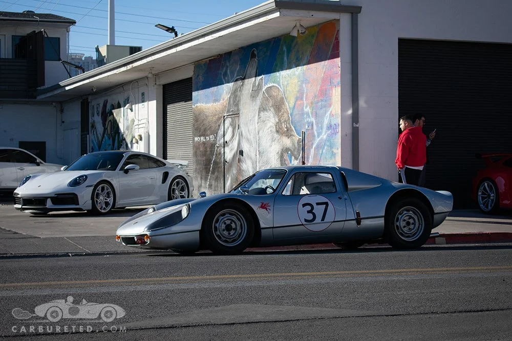
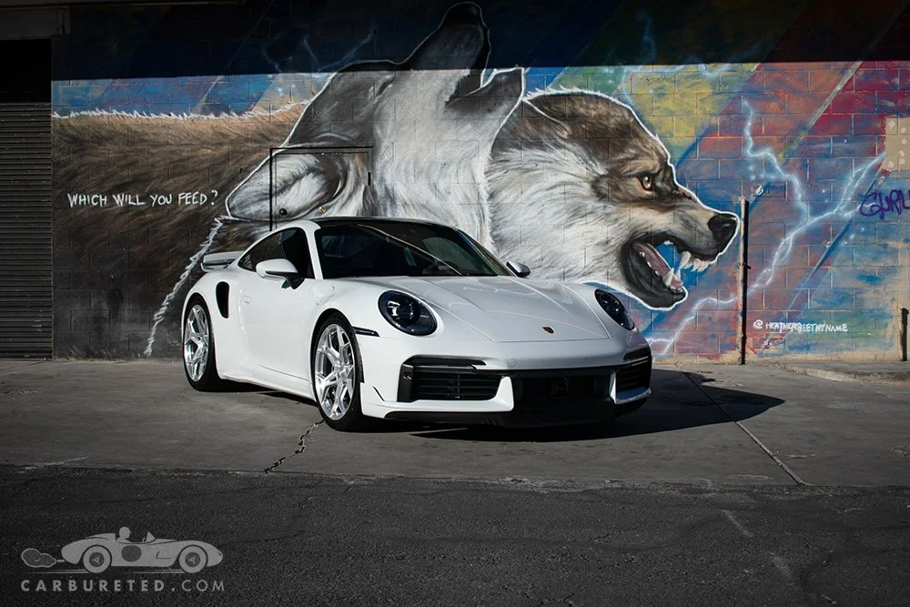
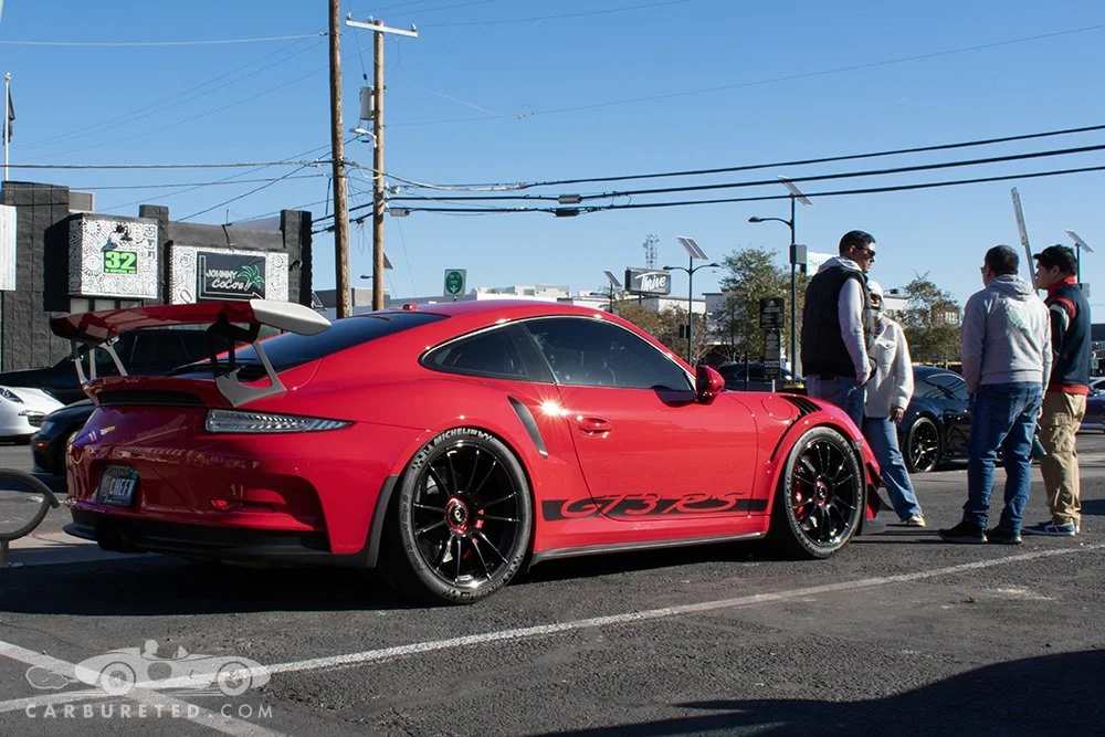
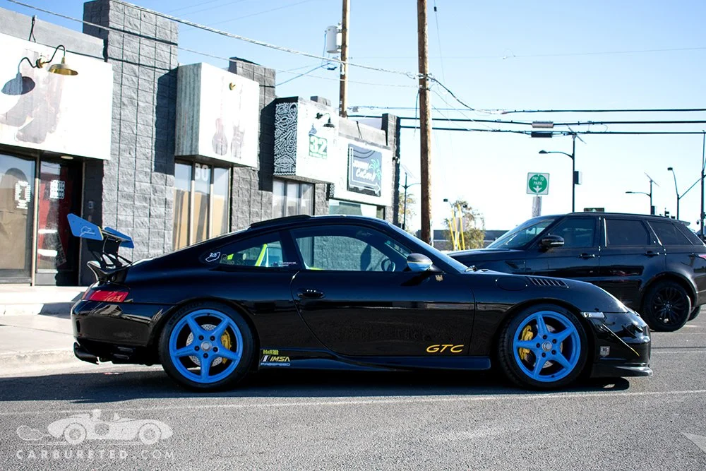
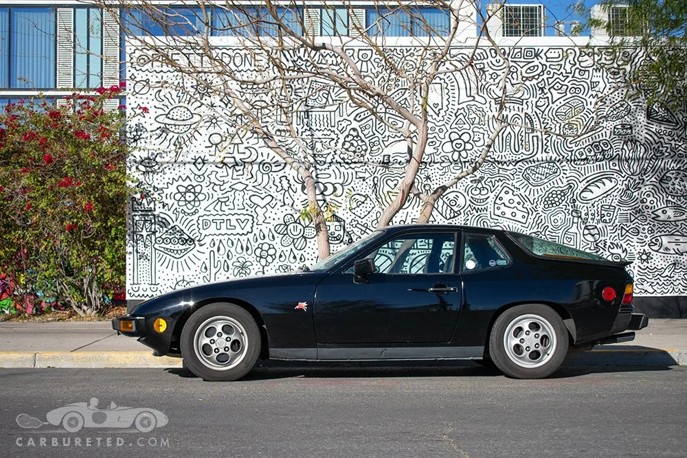
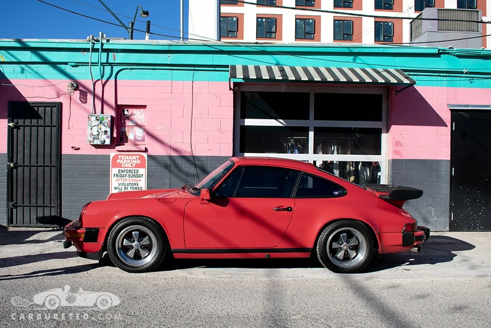
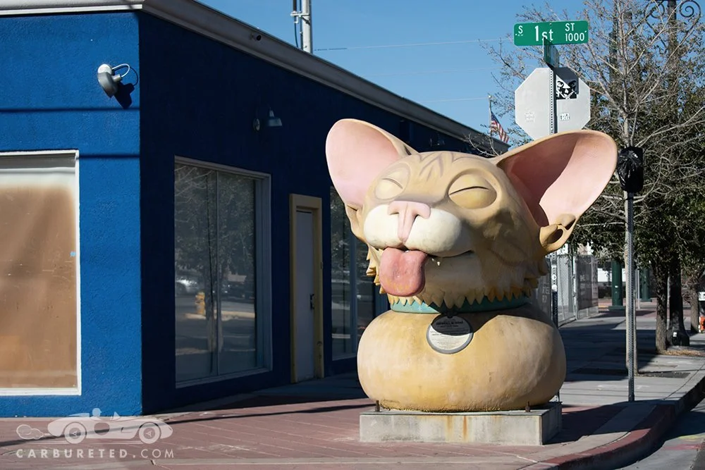
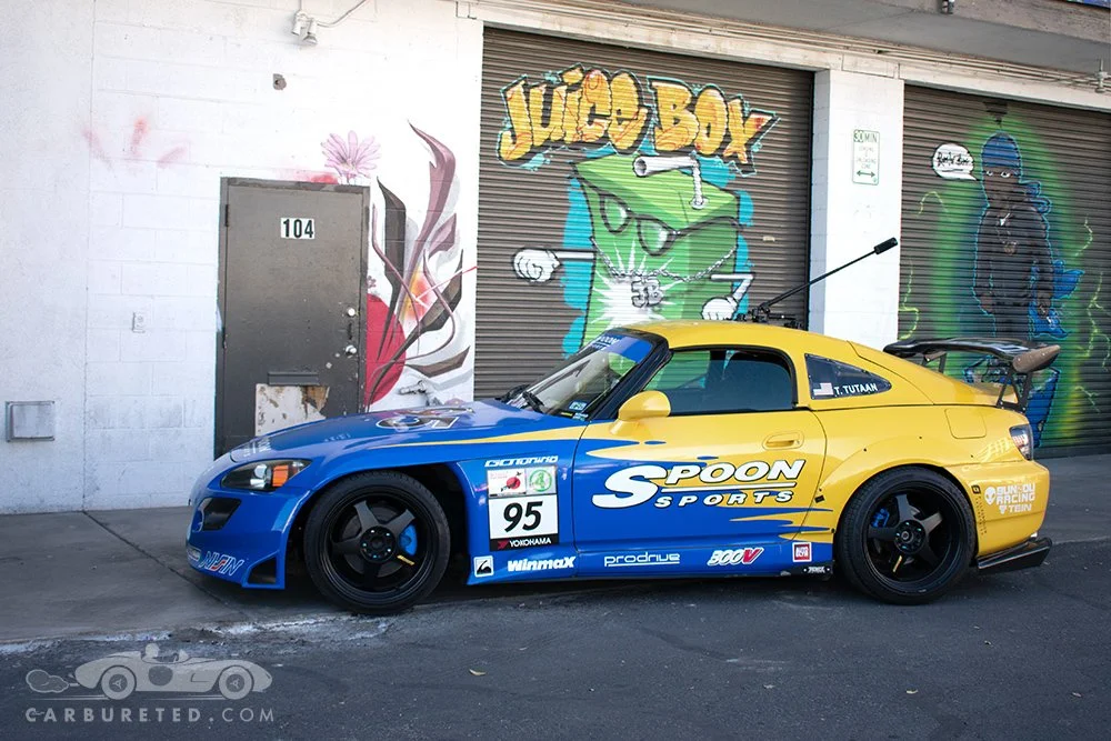
Took a field trip to the Arts District today for the monthly Cars Und Kaffee meet today. This meet features Porsches, though a few other makes usually represented. If you’re in Las Vegas on the last Sunday of the month, it’s worth waking up early to attend! Nice folks, cool cars, and good coffee in one of the more interesting parts of the city!
LLV Gearheads' Annual Car Show


November 14 marked the LLV Gearhead’s 2025 car show, benefitting the St. Jude’s Ranch for Children.
Though rain was feared in the run up to the show, the weather ended up cooperating. The show went off without a hitch, and was very well attended.
A diverse selection of over 40 cars graced the grounds of the wonderfully picturesque Lake Las Vegas Athletic Club. This year, the event was elevated by live music, courtesy of the talented Malibu Destiny.
Many thanks (and congratulations) to Michael Khan, club members, and volunteers for hosting a fantastic event! Looking forward to 2026!
LLV Gearheads


I recently become affiliated with a great local car club, “LLV Gearheads”, based out of Lake Las Vegas (actually in Henderson, NV).
A few of us recently got together for a quick shoot to promote the club’s annual show, which will take place on November 14, from 3 to 7 pm. The show is still in its infancy, but features some great cars, live music, and food in a wonderful venue (Lake Las Vegas Sports Club). Admission is free, and proceeds from donations, raffles, auction items, etc. will benefit the St. Jude’s Ranch for Children, in Boulder City, NV. If you’re in the area, drop by!
Retro Render: Circa 1985!
I recently found this sketch… from high school!
I went to a fantastic private school (Holy Ghost Prep), but art wasn’t part of the curriculum, and the internet wasn’t a thing, back then. So when it came to learning how to sketch cars, I was pretty much on my own.
I guess I always had a thing for Giugiaro’s work. LOL [More recent work here]
2025 San Marino Motor Classic - It’s a Wrap!
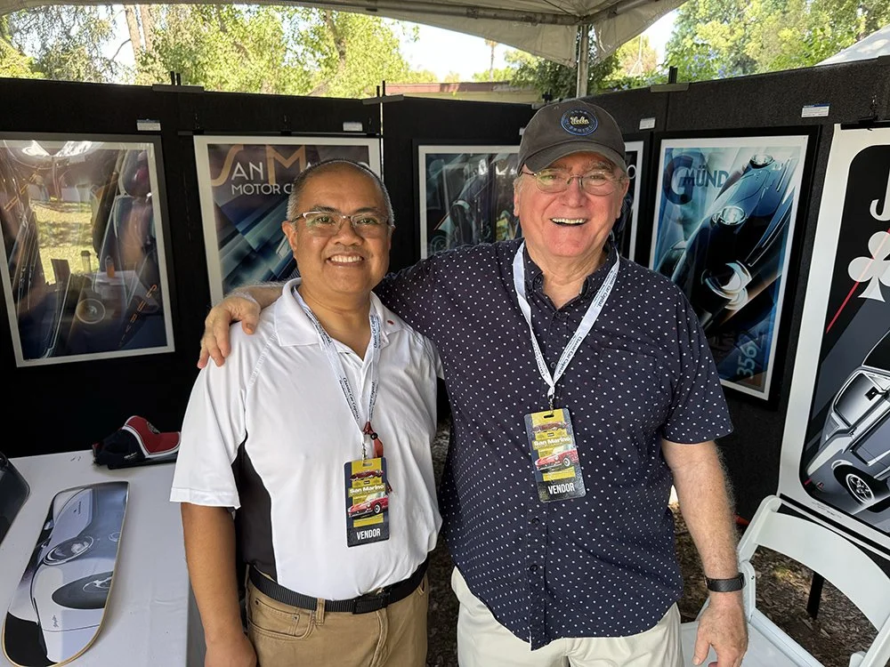
As always, the 2025 San Marino Motor Classic was a whirlwind of fun. Braving the heat to set up my exhibit was challenging, but well worth it. Both the reception and the show were well attended, and it was a a blast interacting with attendees, and catching up with friends/colleagues. I felt honored to show my artwork along side fellow artists Richard Pietruska, Camilo Pardo, John Frye, Tom Garner, Dwayne Vance, Steve Posson, and more in the Art Expo.
You may have noticed the 2025 San Marino Motor Classic poster in the gallery above. The typopography in this piece was originally Duesenberg themed, for obvious reasons. But at the 11th hour inspiration struck, and I changed it to reflect the name of the show. With permission to use the name, I was only able to make a handful of prints. But this piece will be coming back as the 2026 artwork for the show!
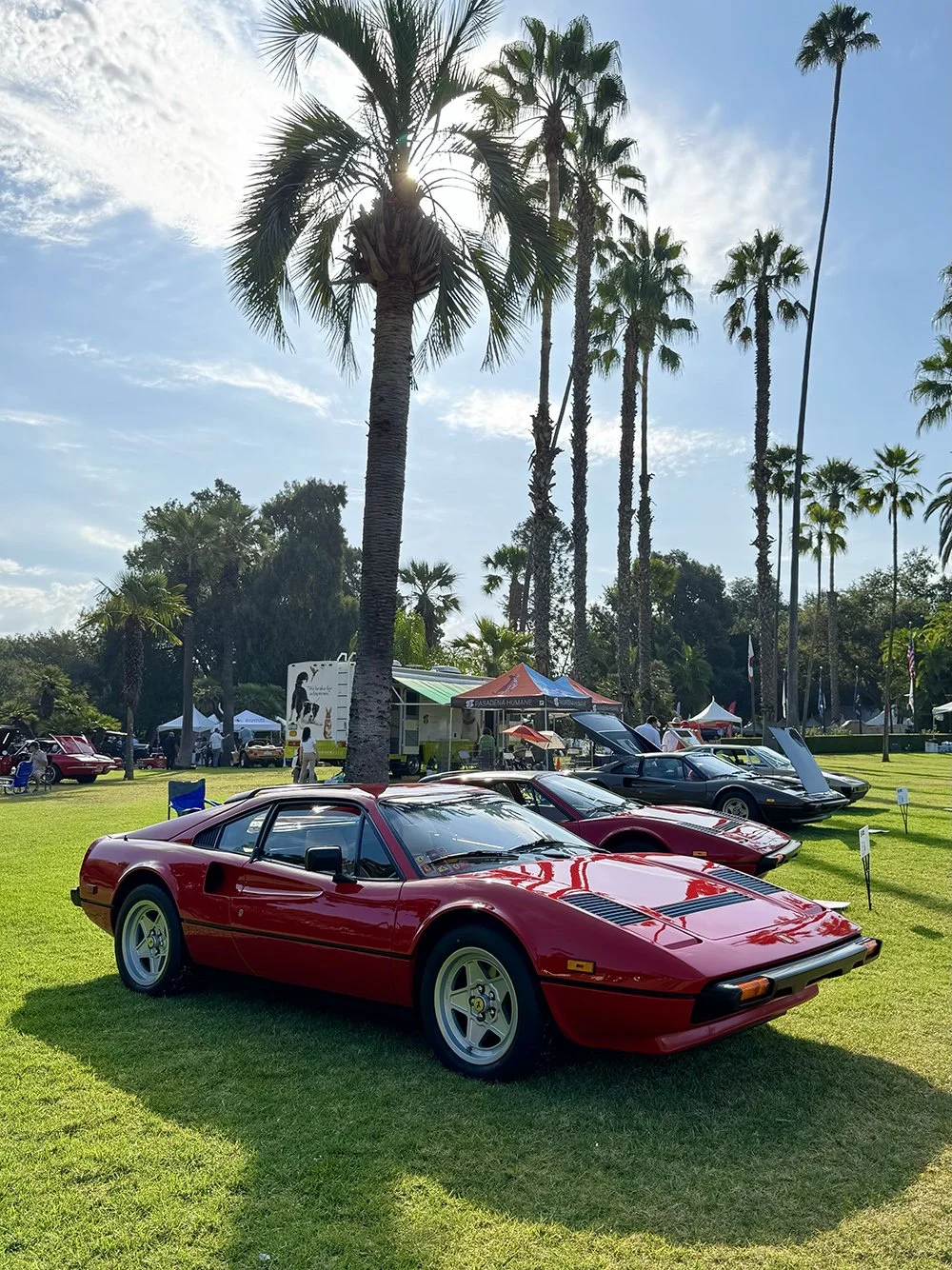
I loved that the concours had automobiles for every taste. There were Art Deco cars (some featured at Pebble Beach the previous week), classic italians, American muscle cars, exotics, and even some from the malaise era! This is one of the most enjoyable car events in Southern California, and benefits numerous charities. Congratulations to Aaron Weiss, his family, and team of volunteers… I’m already looking forward to 2026!
Back to Basics
I sometimes find it oddly satisfying to review foundational viscomm principles, and recently spent time hand sketching shadows using 2 point perspective. I recreated the process here in Adobe Illustrator…
Mini - Blue or Orange?
One of the nice things about working digitally is the ability to iterate endlessly.
In the upper left image, I’ve created a unified color pallet, and give the mini some movement by incorporating perspective lines in the environment, and tilting the whole composition.
In the lower image, the composition is relatively static (though the car is off center), but the opposing colors give it vibrance.
I’m not sure which I prefer… or if another iteration is in the works! Thoughts?
Cars und Kaffee


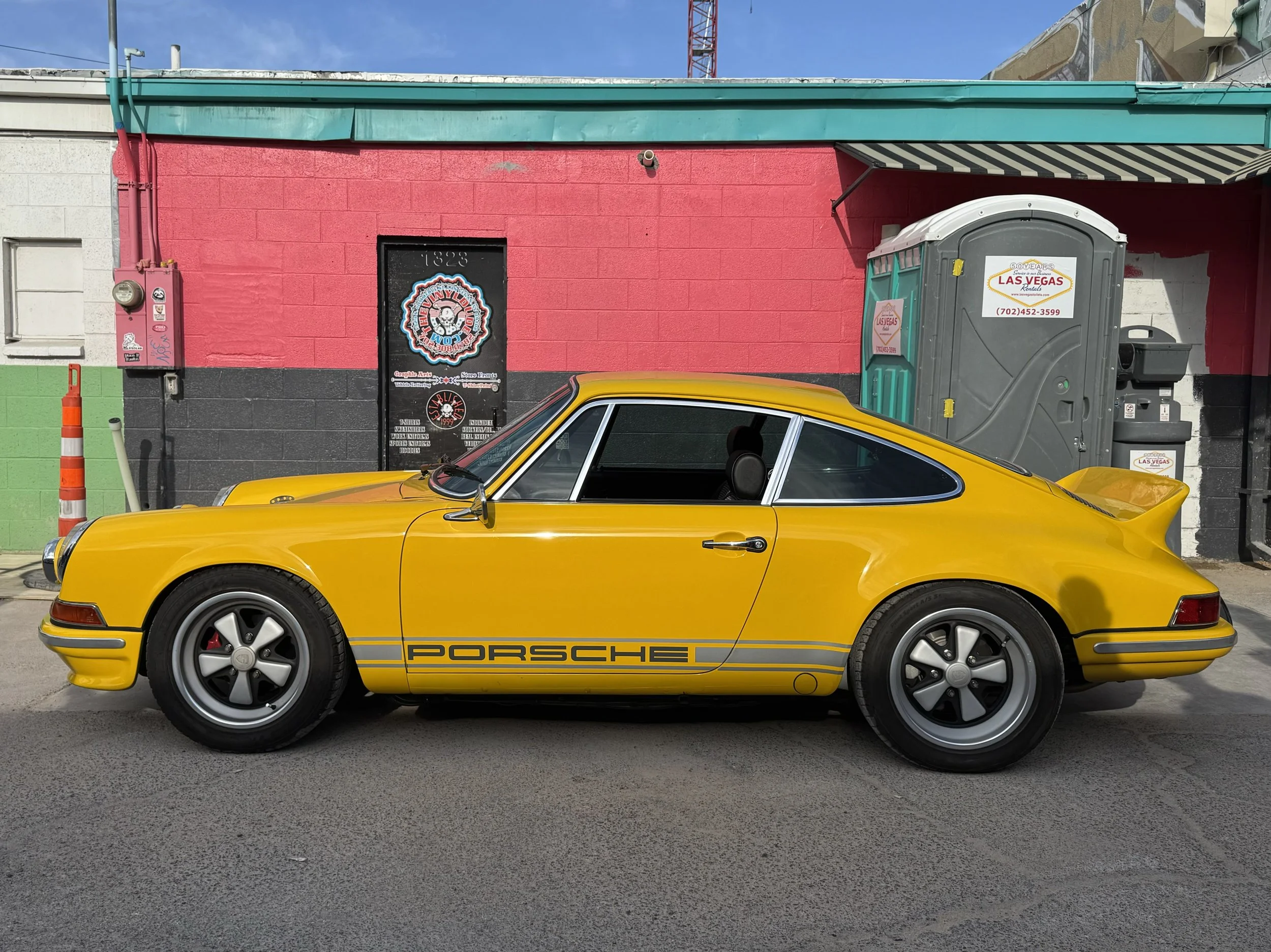


Cars und Kaffee is a nice little car meet held on the last Sunday of every month in the Las Vegas Arts District. The show is primarily a Porsche meetup, but a few other interesting cars show up, as well. I love the location… urban, and somewhat gritty (in a good way)… and the street art makes for some very vibrant photos!
French Curves; Two Variations on a Theme
French Curves, Version 1
French Curves, Version 2
I’ve always been fascinated with the Art Deco era, which embodies the ideas of glamor, luxury, and playful optimism in its art, music, and design.
During this time, the automobile was at the forefront of technology, and represented speed, and excitement. Aesthetically, they differ greatly from their modern counterparts. Their forms are broad, and sweeping. Their proportions are flowing, with vast hoods, short trunks, and narrow bodies punctuated at the corners with voluptuous fenders over massive wheels/tires. Though these attributes are sometimes echoed in more modern designs, it is interesting to study them as implemented on cars of the 1920’s and 1930’s (in their purest form).
Similar to some of my more recent explorations, my aim for the first version of my piece (upper left) was to pay homage to advertising art of the era. The nighttime scene evokes a sense of mystery, a cityscape background lends an air of sophistication, and a plane represents speed and travel. Unlike many of my other pieces, I excluded much of the car body in order to put focus on the front fender – where I found the most interesting shape/volume. To further emphasize this shape, I reduced the contrast, color saturation, and brightness of the environment. Lastly, I added typography that identifies the car, to evoke more Deco aesthetics.
I was pleased with the finished image, but also inspired to explore a more abstract, less “period correct” version (upper right). First, I removed the figurative environment to decouple the car from a specific space and time, and to minimize distraction from the fender shape.
Later, I introduced a second car to the image (the Talbot Lago Teardrop, because its front fender form was similar to the Bugatti’s). With its introduction, the piece was no longer specifically about the Bugatti, but more about cars of the era. At first, I rendered the Talbot Lago as a ground plane reflection of the Bugatti. But as I played with its location, I found that by flipping it horizontally I could position to create a visual interplay between its fender, and the Bugatti’s… encouraging the viewer’s eye to move between the two forms. With the two cars’ juxtaposed, I rotated them to an extreme angle to imply movement, and to further abstract the cars. Finally, I wanted to include a type element in the piece. But rather than identifying the cars, I decided to acknowledge the shapes. “French Curves” seemed like an appropriate phrase given the origin of the two cars, and the emphasis of their fender forms.
Fine art prints of both of these pieces will be available soon. Does one speak to you more than the other? Let me know!
Composition in Opposing Colors
Mixing things up a bit in this piece. Here, I’ve concentrated more on composition and color, and de-emphasized the literal representation of the car.
Using opposing colors creates a vibrant, energetic feel. I originally rendered the orange-on-blue version as a stand alone piece. But I later decided to add the opposite (blue-on-orange) counterpart to give balance, and made the cars move in opposite directions (nearly exiting the frame) to keep the piece from feeling static.
A translucent halftone pattern was integrated to pat homage to Roy Lichtenstien — an artist I’ve always admired. But rather than emulating comic book printing technique, it’s used to give some subtle texture to gradations.
Iterations that more completely obscure the car were created while exploring this aesthetic, but I settled on this version to give this first experiment some grounding in reality. If I continue to stay in this space, I might go deeper into the non-figurative.
Blue Steel
A compilation of some of my more recent renders, which have allowed me to indulge my fascination with Art Deco, and also my penchant for the color blue.
Also note the new carbureted.com logotype! I’ve been playing around with some new designs that are perhaps a bit more elegant than my current one.
Orange is the New Blue
Lately, I’ve been working in a predominantly blue pallet with orange accents (to give the otherwise cool feeling some warmth).
To mix things up, I reversed the colors in this latest piece, which yielded a warm, energetic mood.
‘24 Lake Las Vegas Car Show
On Nov. 15, Lake Las Vegas Gear Heads held their 3rd annual car show. Set on the beautiful grounds of the Lake Las Vegas Sports Club, the wide array of cars were enjoyed by a wonderful crowd of attendees who also partook in food, drink and live music. I was fortunate to have my Delorean prominently displayed on the patio, with the amazing McLaren, and Auburn.
Load in for participants started at 1pm, and the event lasted until 8pm. This afforded photo opportunities in varying light, which yielded some interesting results. Gear Heads’ club members are an enthusiastic, amiable group with cars from many decades representing the US, Europe, and Japan. Kudos to Michale Khan for organizing the event… looking forward to 2025! Proceeds from the event benefit City’s St. Jude’s Ranch (Boulder City).
’24 San Marino Motor Classic — In the Books!
The ‘24 San Marino Motor Classic was amazing. Saturday afternoon’s artists’ reception was well attended, and afforded the opportunity to socialize with the attendees and fellow exhibitors. The evening’s gala impressed, with food, live music, and a parade of cars from many eras. On Sunday, Lacy Park hosted a field filled with rare, significant, and beautiful cars.
It was an honor for me to be included in the Automotive Fine Arts Society’s art show, along side some fantastic designers/artists, including: John Frye, Tom Garner, Richard Lewis, Dave Marek, Ron Matthes, Rob Nickell, Richard Pietruska, Camilo Pardo, Jamie Schema, and Mark Stehrenberger. I wish I took more shots with fellow exhibitors/friends/attendees, but being lost in the moment… I forgot to get my camera out! :-P
A fun time was had by all, and many local charities benefited from the event. Congratulations (and many thanks) to Aaron and Valerie Weiss et al for organizing this wonderful concours and gala. I’m already looking forward to 2025!


Aspect Ratio
1967 Corvette in the Style of Roy Lichtenstien
In the digitally connected era, I believe that the vast majority of people consume art through their mobile devices. This is good, in that people have more access to art than ever before. But this also means that certain constraints inherent to these devices impose themselves on the art. At small scale, it becomes less important for the artist to worry about finite details. Fighting for attention on social media, art might need to be more brash or vibrant to compete for attention. And certain platforms mandate that art conform to specific aspect ratios to optimally use screen space. Square images, for example, are optimal for Instagram posts. While tall, thin posts work well for IG stories and iPhone screens.
Here, I’m breaking the mold by rendering this 1967 Corvette in an extra wide (3:1) aspect ratio. Because this doesn’t translate well to mobile devices, or Instagram, I feel that it is unexpectedly refreshing. Further, this wide format relates well to the low/long proportions of the car. On the internet, this piece is best seen on a website, like this. But this would be better viewed in person where it could be produced in an absurdly large scale! I’d love to see this displayed in a 2:1 scale (or larger)!


